Power BI and Creating Custom R Visualizations: Pre Getting Started / First Step Install List2/1/2017 I was recently on VM (virtual mentoring) duty at Pragmatic Works (PW) and was asked to fix someone's custom R visualization in Power BI (PBI) Desktop. Consequently, it was "Hello, R scripting!" for me, and of course, I wanted to apply all that I've learned in t-SQL, VB, C#, MDX and DAX. First suggestion: Don't do that. Here is the skinny: Before you try to create custom R visualizations in PBI, do these things: 1. Download and install Microsoft R Open from https://mran.revolutionanalytics.com/download/ /or/ Download and install R for Windows from https://cloud.r-project.org/ 2. Download and install Microsoft R Client from https://msdn.microsoft.com/en-us/microsoft-r/r-client-install 3. Download and install R Studio from https://www.rstudio.com/ 4. (Optional) Download and install R Tools for Visual Studio (preferred by some over R Studio for R development) https://www.visualstudio.com/vs/rtvs/ https://microsoft.github.io/RTVS-docs/ 5. Make sure you have the latest PBI Desktop version installed. (Look in the lower right corner of the PBI Desktop software and if there is no informative message of an available update, you are all set.) 6. Verify that PBI Desktop is set to use installed R components. In PBI Desktop, go to File --> Options and Settings --> Options --> R Scripting. The R home directory and Detected R IDE properties should be filled in appropriately. 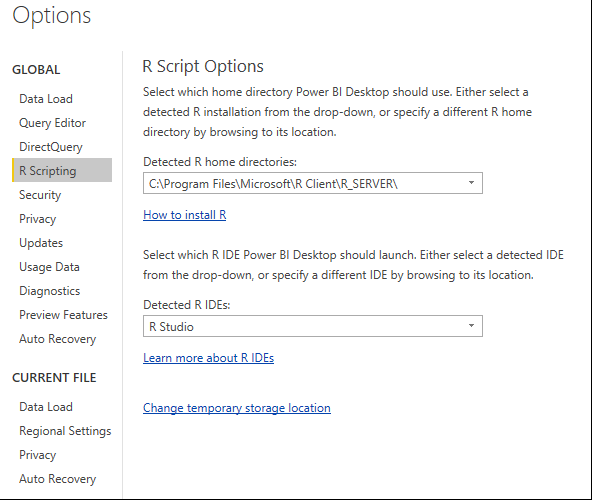 You will find many tutorials already on line, so I'll just share what I learned about what I call "pre-getting started": 1. You must have #1, #2 and #6 complete (above) for some of the R-powered visuals from the PBI Custom Visuals Gallery to even install without error in Power BI Desktop. 2. When you are told in tutorials that "of course you have the package installed" or "you may have to install the package first", what this means is that you must open R Studio and install the R package before the R script in Power BI Desktop will run. This is the first four lines in the screen print below. 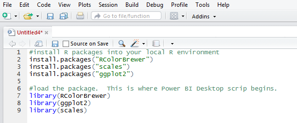 With the necessary R applications installed on your workstation, and the R packages you intend to load in PBI installed in your R environment, you are now ready to begin.
3. I suggest strongly that you get your R visualization working correctly in R Studio (my preference) or R Tools for Visual Studio because PBI Desktop does not provide meaningful error messages. 4. Final tip: PBI R-powered visualizations aren't EXACTLY identical to what you will see in R Studio, especially if your 'x' or 'y' axis is a date or time data type. You may need to work with text data types to get around this. Note: Virtual mentoring at Pragmatic Works is a great way to get pay-as-you go consulting help from an industry leader in the MS BI tool stack (just saying!).
2 Comments
 Pops Outs Screen real estate in a Power View report is at a premium, and one of the ways to get more in the space allotted is to create smaller scatter and pie charts and rely on their pop out feature. Click the blue "up arrow" in the upper right corner.  Small detailed charts --> 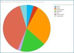 Suddenly become readable -->  Pop in using the "down arrow" to return to original size --> Themes On the Power View ribbon, click the Themes button. This is a simple and quick way to customize your report! 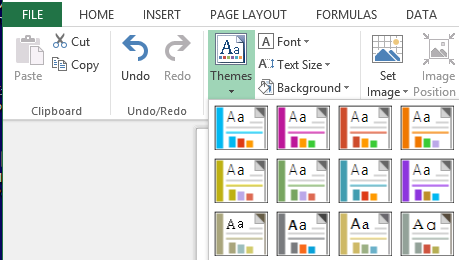 Font Changes There are two ways to change the font in Power View: 1. Change the font of the entire Power View report. Go to the Power View ribbon and select the Text Size menu option. 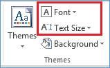 2. Change the font of a single chart. Go to the Design Ribbon and click the Text button  For more fun with Power View, see Fun with Power View I: Enhance your report with Tiles, Slicers, and a Play Axis.
I am frequently asked, "How can i dress up my Power View report?" In return, I end up sending an e-mail that I typed up the first time someone wanted formatting tips for Power View. You can consider these "beginner tips", but hey, we all begin at some time! For a deeper dive into Power View, I recommend Brian Larson's book Visualizing Data with Microsoft Power View. If you have a bit of initiative and want to have a little fun, just read below. Tiles These are a filtering option in Power View. I think of tiles are visually appealing slicers. Click onto a column in a Power View data table. From the Design Ribbon, click Tiles. A second option is to add a tile directly in the Power View Fields window. under Tile By. 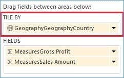 The result should be "tiles" running across the top of your table. The tile "United States" is highlighted below. 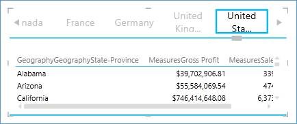 If you have a tile attribute that is "unknown" or "n/a", use filters to remove it. If you do not see a Filters bar in your Power View work space, go to the Power View ribbon and click on Filters Area. Expand the Filters Area and click on Table. All the column in your data table should now be visible. Expand the column attribute you wish to filter and mark EVERYTHING BUT the offending tile code or description. In the screen print below, every country but Australia will show up in the tile list. 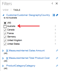 Slicers Slicers are a second way of filtering Power View. The difference between slicers and tiles is visualization, and for me, the amount of screen real estate I can afford to give up for the cause. Create a slicer by first creating a data table with a single attribute / column. The new table is now an attribute list. 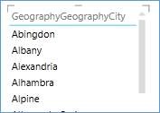 With the new data table selected, on the Design ribbon, click the Slicer button. 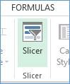 Now the Power View report has a slicer! Note the blue boxes showing next to each attribute. 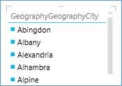 Play Axis The short step-by-step version is as follows 1. Add a Scatter chart to your Power View design area. 2. Set your ‘x’ and ‘y’ axis values. 3. Select your Details property to control what your bubble represents. 4. Select your Size attribute to control the size of the bubbles. 5. Generally select a month, quarter or year as your Play Axis. 6. Click the <Play> button located to the lower left corner of the scatter chart and watch the buggles move systematically across the time element selected in the Play Axis. 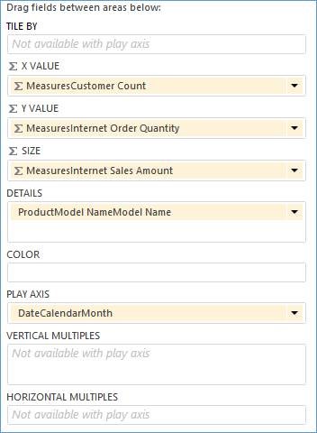 Having a bunch of bubbles jump around haphazardly isn’t very informative, so you’ll want to pick values that gradually move over time. 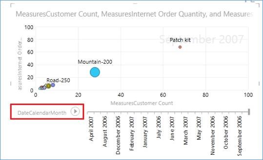 For more fun with Power View, see Fun with Power View II: Enhance your report with Pop Outs, Themes, and font changes.
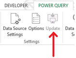 I was asked by a client today which Power BI tools in Excel could connection to a multidimensional cube. Microsoft is constantly adding new data sources and functionality -- especially in Power Query -- and past versions of Excel had some MultiD limitations. However, today if you are running 2013 Professional Edition, you are in pretty good shape! To keep this straight in my own mind, I, of course, created a table, but before you get to that, please be aware of a couple of items. 1. Make sure you have the latest version of Power Query installed. You can tell if are up-to-date when the <Update> button in your Power Query ribbon is disabled. 2. It is important to understand that Excel uses different drivers depending on what tool you use to connect. For instance, a connection to a SQL Server Database through one of these paths … Excel à Data ribbon à From Database à SQL Server Excel à Data Ribbon à Connections à Add à Browse for More à New Source … results in Excel using an OleDB driver. You can see this when you edit the connection and take a look at the connection string. 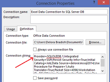 A connection to SQL Server through Power Pivot results in Excel using a SQL Server Native Client 11 driver. 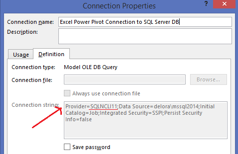 A connection to SQL Server through Power Query results in Excel using a dot NET driver. 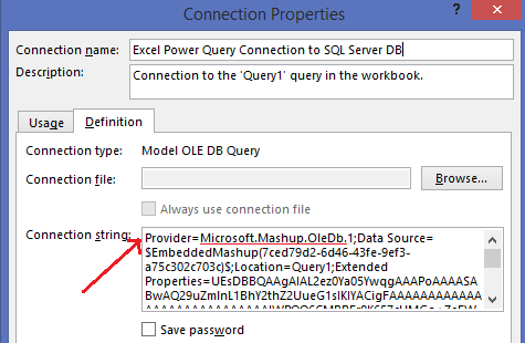 Please keep this in mind as you review the following chart that was current as of June 15th, 2015. Although you can access the same data source multiple ways, be aware of what is really happening in your connection string. 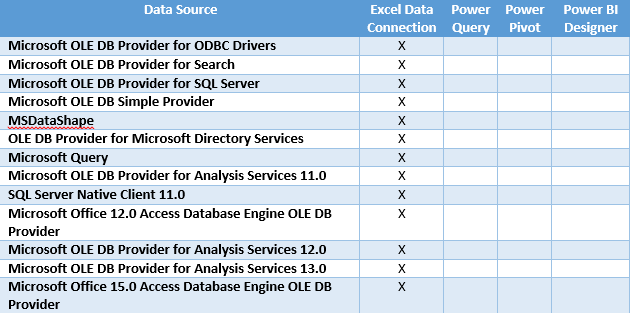 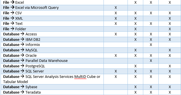 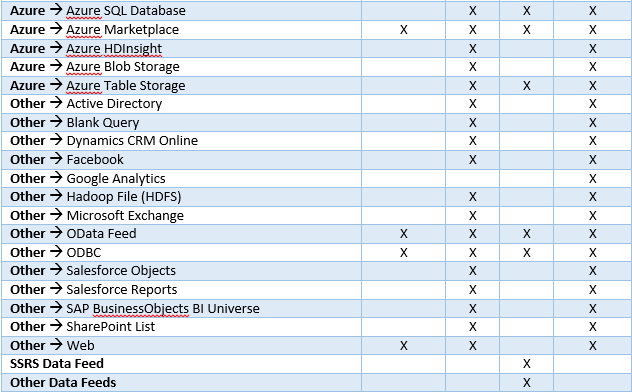 |
Categories |
 RSS Feed
