|
I am frequently asked, "How can i dress up my Power View report?" In return, I end up sending an e-mail that I typed up the first time someone wanted formatting tips for Power View. You can consider these "beginner tips", but hey, we all begin at some time! For a deeper dive into Power View, I recommend Brian Larson's book Visualizing Data with Microsoft Power View. If you have a bit of initiative and want to have a little fun, just read below. Tiles These are a filtering option in Power View. I think of tiles are visually appealing slicers. Click onto a column in a Power View data table. From the Design Ribbon, click Tiles. A second option is to add a tile directly in the Power View Fields window. under Tile By. 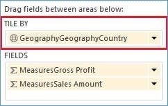 The result should be "tiles" running across the top of your table. The tile "United States" is highlighted below. 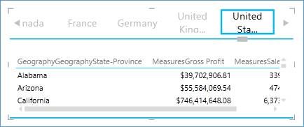 If you have a tile attribute that is "unknown" or "n/a", use filters to remove it. If you do not see a Filters bar in your Power View work space, go to the Power View ribbon and click on Filters Area. Expand the Filters Area and click on Table. All the column in your data table should now be visible. Expand the column attribute you wish to filter and mark EVERYTHING BUT the offending tile code or description. In the screen print below, every country but Australia will show up in the tile list. 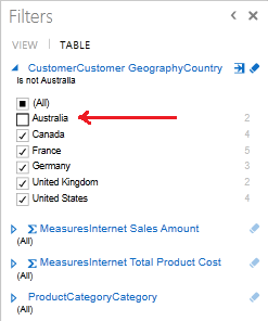 Slicers Slicers are a second way of filtering Power View. The difference between slicers and tiles is visualization, and for me, the amount of screen real estate I can afford to give up for the cause. Create a slicer by first creating a data table with a single attribute / column. The new table is now an attribute list.  With the new data table selected, on the Design ribbon, click the Slicer button. 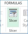 Now the Power View report has a slicer! Note the blue boxes showing next to each attribute. 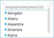 Play Axis The short step-by-step version is as follows 1. Add a Scatter chart to your Power View design area. 2. Set your ‘x’ and ‘y’ axis values. 3. Select your Details property to control what your bubble represents. 4. Select your Size attribute to control the size of the bubbles. 5. Generally select a month, quarter or year as your Play Axis. 6. Click the <Play> button located to the lower left corner of the scatter chart and watch the buggles move systematically across the time element selected in the Play Axis. 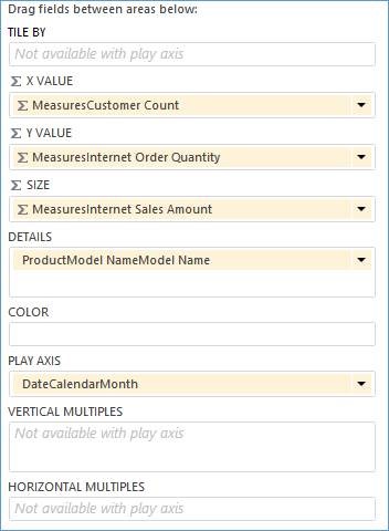 Having a bunch of bubbles jump around haphazardly isn’t very informative, so you’ll want to pick values that gradually move over time. 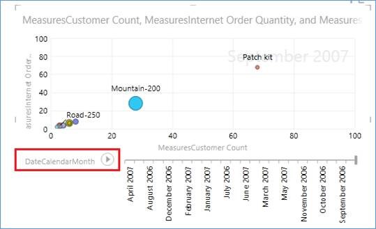 For more fun with Power View, see Fun with Power View II: Enhance your report with Pop Outs, Themes, and font changes.
1 Comment
2/23/2022 04:18:50 am
What an amazing post! I always look forward to reading your posts. Leave a Reply. |
Categories |
 RSS Feed
